Site history
My online presence began somewhere in 2001 and it was under the ROBO Design pseudonym. ROBO Design was a web site where together with my twin brother, we presented our work and what we can do. This page presents the different iterations of the web site.
Jump to:
- The birth (v1.0, 2001-07-25)
- ND4SPDWorld era (v2, 2002-07-27)
- robodesign.ro (v3, 2003-07-14)
- Fairytale (v4, 2004-12-17)
- More personal (v5, 2007-02-13)
- The separation (v6.0, 2014-05-04)
- Moving on (v6.5, 2023-03-06)
Version 1 (2001-07-25)
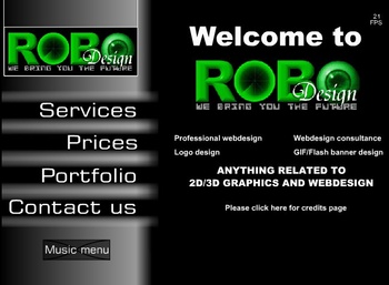
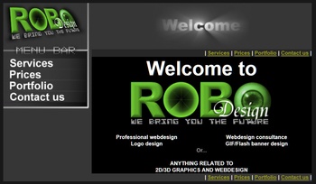
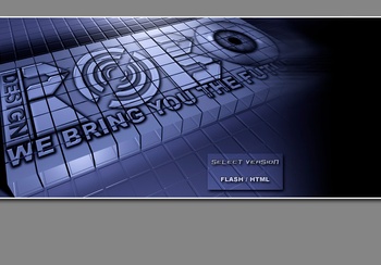
The first site version came in two formats / editions: one in Flash and the other in HTML, both non-dynamic and really ugly :). You can notice the "very old" looking logo. When people entered the site, they had to choose which version they wanted.
Version 2 (2002-07-27)
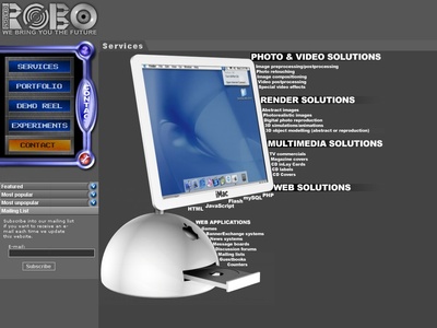
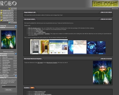
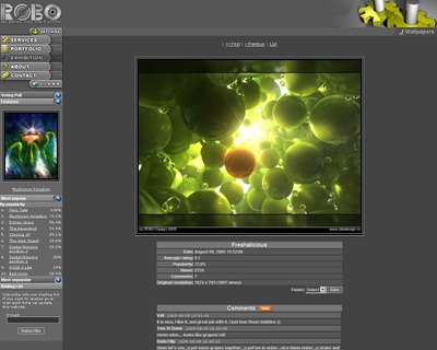
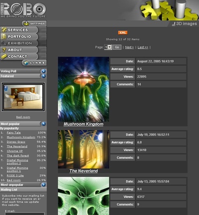
ROBO Design v2 web site was released on 27th of July, 2002. Quoting our news back then: "This is a database-driven web site using mySQL and PHP". It did not have an administration module to manage the content. Features: comments, image rating and collapsing panels - this one alone was cool for me :). This was the first PHP and mySQL web site made by my twin brother.
This web site was hosted for free, thanks to some friends we had back then at nd4spdworld.com.
At the release date, the site had a slightly different interface. This one was created on 12th of June, 2002.
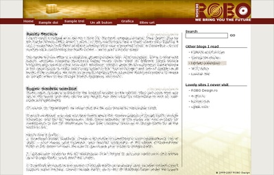
After several months, in October 19, 2002, we released an improved interface, which was really acceptable and it had a menu structure that we liked at that time. More details in the blog entry from back then.
As you may notice, for this small new version, I also created a new version for the ROBO Design logo. As unbelievable as it sounds, this logo was painted in details using Microsoft Paint, on Windows XP. After several weeks, it was repainted in Photoshop and made to look shiny. By 14th of May 2002, this logo was completed. I also made a simple avatar image.
This version "featured" an annoying splash/intro page with a huge image where users had to click "HTML version" to get to the site and they were told that a Flash version of the web site will be released. :) This never materialized.
Version 3 (2003-07-14)
Related blog entry: ROBO Design v3 release announcement.
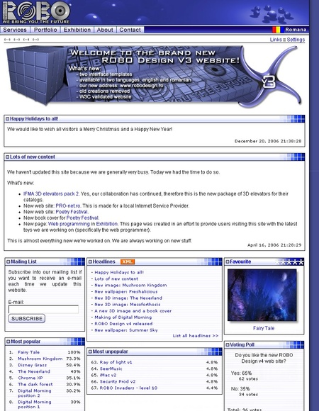
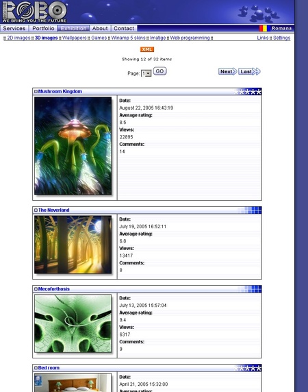
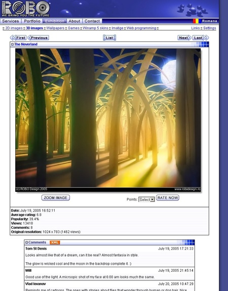
Regarding graphics, design and usability, this brand new site was pretty nice when we released it. It was more advanced than the previous version, but still no Content Management System (CMS), thus it was a hurdle to update it. Features wise, it had two interface templates: v2 and v3. The back-end was completely rewritten, adding support for multiple languages, and interface templates.
Beginning with this version, the site moved to our own domain: robodesign.ro. It was hosted by a friend at S.C. Mobius Solutions S.R.L for a few years.
Version 4 (2004-12-17)
Related blog entry: ROBO Design v4 release announcement. This announcement featured a lot of new content on the site.
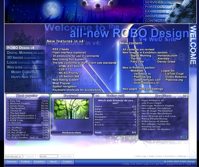
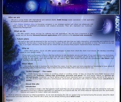
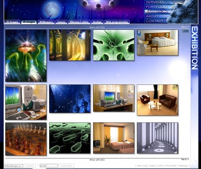
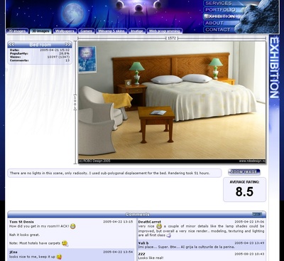
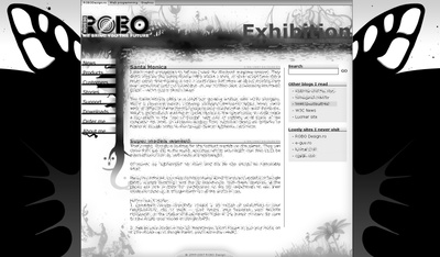
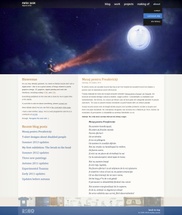
This version was graphically over-worked. The interface was looking pretty good for those times, (IMHO). It was built like some kind of a magazine, entirely graphical. The whole site had a fairy-tale theme, as a summer night. I created an image to go along with the site theme: Fairy-tale - which is still available on the site. Because of the intensive graphics, dial-up users had to have patient to load it. The new site had many new features: RSS 2 feeds, 35 emoticons for comments, a new voting poll system, the site was conforming to many web site standards and guidelines, a new rating system and keyboard shortcuts for accessibility. The site used the same back-end as version 3. It also had an option to enable a Flash version of the top bar. It featured a long animation of a summer night sky.
All the emoticons were painted in Photoshop, mostly pixel by pixel. I've been inspired by the ones found in MSN, hence the color scheme, and the ones found in Yahoo IM. They were all finished by 7th of August 2004.
![]()
Here's an early version of the interface, but I never finished it. The menus were supposed to have a mini-Flash game :).
The ROBO Design v4 logo avatars:


Version 4.5 (never published)
We worked on further improvements to the ROBO Design version 4 interface. Initially, the interface did not fit on the 800 x 600 resolution. The new version 4.5 had a completely reworked CSS layout. Even if the page looked the same, the interface was capable of dynamically rescaling to lower resolutions.
Also, version 4.5 served as a very good testbed for the new Opera Voice feature added in Opera 8. The site had a complete Voice navigation system which worked quite nice.
This version also had permanent links into the site engine.
The site was not released due to lack of time. When we had time, we no longer liked the site, because it was way too bulky.
Version 5 (2007-02-13)
Related blog entry: ROBO Design v5 release announcement. A lot of new content was published this time as well.
This version had an entirely reworked site back-end. This version no longer allowed rating images, posting public comments and had no emoticons. This was all on purpose. We no longer wanted to deal with spam, so we decided the new site must focus more on the content - not community-like features. What we did instead is to give users just a simple contact form which allowed the visitor to quickly send us an email regarding the page he/she was viewing.
The site was done during high-school and we participated to some school contests with it.
Main features of the 5th installment: our own site search, a Google site map, permanent links - easy to remember, a blog with Atom feeds, and a nifty CMS made by Mihai. I was able to update my site in an easy way, phew ;). All the previous site versions were cumbersome to update.
The interface of this version of the site was not professional, because we wanted it more personal, subjective.
We initially thought we should split the site into different "sides". I designed the interfaces and... while I designed the front page, a shiny idea came. We dropped both interfaces. These are the initial designs, made on 11th of January, 2011:
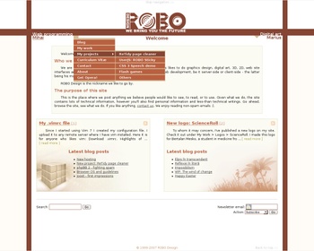
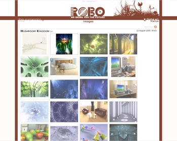
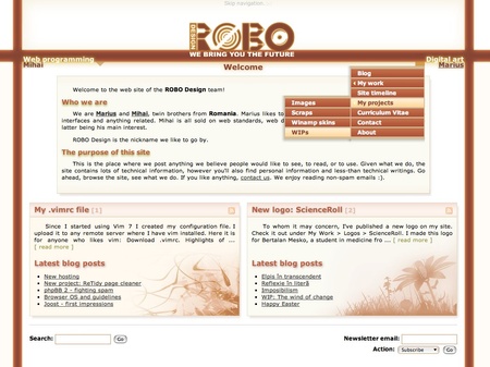
Here's the interface of the web site, at the time we released it:
We wanted the site to have dedicated sections for both of us, in a single site interface. So, it is quite clear that by having many menus, we would have cluttered the whole site. We took the decision to hide the menus under two named parts/sides. We are aware that this choice makes it harder for some people to browse the site. Over time, this proved to be a wrong decision and the biggest culprit of this version.
This site version had keyboard shortcuts and it was working in text-only browsers.
I tried to make a clean interface. The color theme was inspired by the colors used in earlier versions of the Ubuntu Linux distribution.
To some extent, the interface is within the same "fairy tale" vision as ROBO Design v4 was. The new interface of ROBO Design v5.5 emphasizes this aspect.
Version 5.5 (2007-07-23)
This update added several new features in the Content Management System. Awebitor, the WYIWYG editor from the CMS, got a good set of improvements, related to the layout.
The entire graphical user interface has been reworked, adding an "eye-candy" factor to it. The interface is a lot more glowish, and technically more advanced than the previous one.
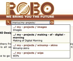 Back then, when we released the new version, we were very proud about a "universal search" field Mihai implemented in the site. The search field allowed the users to easily access different pages and search through their titles with auto-complete. It even allowed them to leave the site by entering an external URL.
When you were moving the mouse over the title bar (below the logo), users were able to see the current page address, like a breadcrumb. By clicking on the search icon, the address would change to a "universal search" field. The entire user experience was rather flawed and cumbersome to use, counter-intuitive, probably for most people.
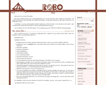
In version 5.5, Mihai improved the compatibility with Internet Explorer 6 and 7. We also made an interface specific for hand-held devices. We did our best to ensure users of portable devices will enjoy browsing this site with browsers from that time, such as Opera Mini or Opera Mobile. However, the cumbersome menu navigation, was not ready for touch devices.
We also provided the users a print style-sheet. The web browser is using the style-sheet to print the page how the designer choses. When you wanted to print a web page, you only got its content - no navigation, no fancy graphics.
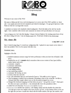
Additional screen-shots (the hand-held and print styles):
Below we have some wallpapers and an avatar, published on July 30, 2007:
Version 6.0 (2014-05-04)
Related blog entry: New site version announcement. This announcement featured a lot of new content related to people with disabilities.
Since 2007, our web site stagnated. We sporadically updated the contents. We gradually grew unhappy with it, because the navigation system of the web site proved to be too difficult for users and prevented them from navigating the site and to discover the great amount of content I had in it. As the Web technologies progressed, it was becoming more noticeable how outdated the user interface was for the ROBO Design v5.x site.
In June 2010, I started working on a new web site interface. This time we decided to separate our web sites to prevent cluttering the interface again or to make a complicated navigation system. We also decided to use an Open Source CMS and not waste time and efforts into our own CMS. Initially we thought of MODx, but Mihai decided it was not good enough and we decided to us the Django framework.
The design of my site had several iterations in Photoshop. The initial designs of the new site are the following:
Finally, we agreed on these designs:
By November 2010, I implemented the site interface in HTML and CSS in an early instance in the MODx CMS. Mihai was too busy to help me implement the gallery and blog features needed. Therefore, the project got suspended for some time. Here you can see how it looked like. In the following image, you can notice quite some differences between the Photoshop version and the CSS, HTML implementation.
Beginning with 2011 and slowly through to 2013, Mihai worked on a Django version of my web site and migrated the user interface I did in MODx and actually worked on the features for the blog and gallery pages.
At that time, I have read various resources on UX, accessibility and usability of interfaces and I implemented some of the guidelines. With the new design of the web site, I made my best to make an easy navigation system with fixed position for the menus, repeatable navigation actions through different pages of the gallery or blog pages, etc. So, the design for the site, suffered even more changes.
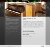
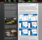
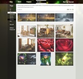
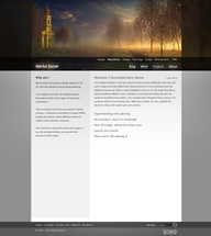
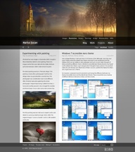
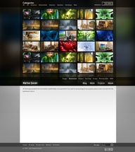
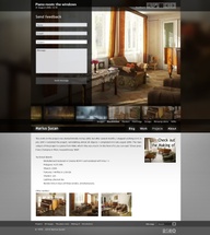
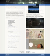
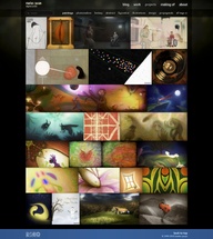
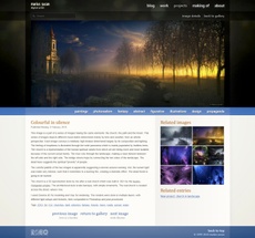
This is how the site for marius.sucan.ro looked like at release:
Please keep in mind that the site changes its look based on resolution and zoom factor. These screen-shots are just to give you a general idea of how the site looked at release.
We implemented a fully flexible interface that adapts to almost any screen or device. This is a fluid responsive design. The main focus is the content. The design uses specific colour schemes for gallery pages and other pages. The top section is very dark for gallery pages, to make the images standout, and the written content is in the inferior section, on white.
The interface features an always visible menu bar. It also does not change its position when navigating from one page to another, making navigation easier. The blog posts and the images can be navigated using repeatable mouse actions. The previous / next buttons remain in the same place between pages. The Related column is populated based on tags and relationships between blog entries and images. This facilitates the discovery of content on the site.
We both have our own web sites: mihai.sucan.ro and marius.sucan.ro. We transformed robodesign.ro into a simple landing page that gives the visitors the option to pick one of us to visit.
We had plans to make a new web site for Mihai as well, but the plans never materialized, because he died of cancer in April 2015. As a last-minute solution, we simplified the ROBO Design v5.x interface, by eliminating the navigation sections of the contents belonging to Marius.
Version 6.5 (2023-03-06 - current version)
Related blog entry: Good news everyone announcement.
Since Mihai died, my site gradually became technologically obsolete and it became apparent there were some serious flaws with the back-end, with Django. Even before Mihai died, we were discussing about replacing it with something simpler. One of the biggest problems of the site was the caching system. Each time I updated the site, the whole content had to be regenerated and re-cached. This caused the site to go offline for sometime, or at least, become very slow. To add insult to injury, the system automatically refreshed its caches monthly.
The interface, even if I designed it in 2010, remains pleasing enough for me to not want to do an overhaul. The new version of the site features a new back-end, dark mode (UI), and... nothing else. This new back-end is the Astro framework. The transition to it was possible thanks to Dennis Schubert. Huge thanks for his efforts and help for doing this!
The new back-end allows me to update the site even easier. Therefore, I will try to become more active on the blog.
The only "major" feature dropped in the new version is site search. I bet no one will miss it.
This version of the site will probably be the last and final one, as I intend to never make a new version, just maintain it as long as I am alive.
