Hello, friends!
I am a happy Windows 7 x64 user since 1st of January 2010. Although, since day one I wasn't happy about the default Aero theme, because it is too transparent and the title bars texts are not visible on dark wallpapers and such. So, last week I thought of doing something different. Here's a Windows Accessible Aero theme done by me, based on the default Aero theme. I just changed what I thought it lacks contrast. I've searched on-line for such themes, but I liked none of them. As such, I publish this theme for others who might need such a theme.
Download the Windows Accessible Aero theme (ZIP archive)
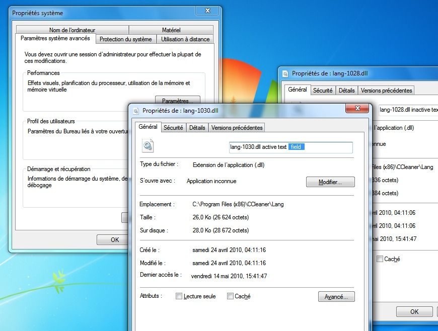
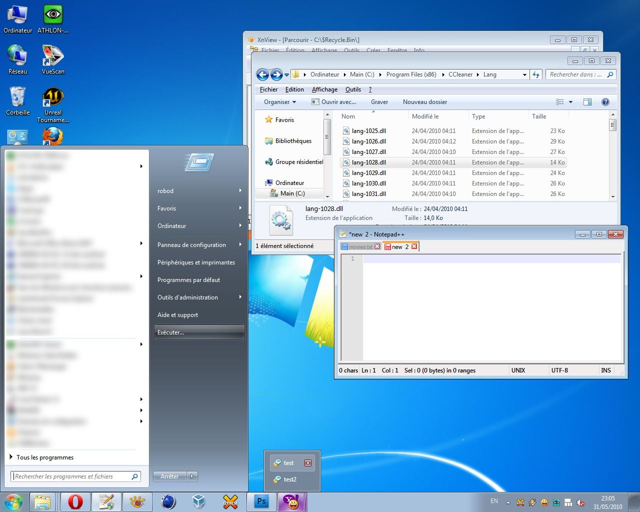
For easiness, I prepared several screen-shots portraying the difference between my theme (Accessible Aero) and the default Aero theme. These screen-shots are a mash-up of different Windows elements, in Basic and Aero modes.
![Screen 3: Accessible Aero theme [Basic mode]](/_astro/screen3-basic-robod-theme.ad18c377_GouPt.jpg)
If you like what you see, download the Accessible Aero theme here.
Here is a round-up of what this theme features:
- considerably less transparent glass, dark glass
- white text title bars with black glows, so they are readable irrespective of the background of the window
- increased contrast in the title bars for the Basic mode, when not using Aero and I also adjusted the caption buttons accordingly by enhancing the contrast between the glyphs and the buttons
- a much darker task-bar in Basic mode, making the clock and pop-up titles of the applications running much more readable
- a darker Start menu in Basic mode
- increased contrast for the Alt-Tab application switcher in Basic mode
- added a strong white glow to Alt-Tab app switcher to make the the title visible
- made text fields slightly more visible
- defined a clear difference between active and inactive text fields, making the borders thicker
- a more visible highlighting color for menus, pop-ups menus, while trying to maintain the default look
- file column headers in Explorer or other applications, are enhanced as well; more visible and a more clear border between them
- changed the gray text color of tool tips to black for increased readability
- added dark glow to application titles in task bar and in the thumbnails to avoid situations when the titles are unreadable
- made the address bar, search field and the whole breadcrumb much more readable; brighter background and darker texts
- more visible separator in unlocked task-bar and other types of separators or window resize grippers
- bigger close button in task-bar pop-up thumbnails
- made the task-bar icons less wide, more ergonomic, both in Basic and Aero modes
- made more visible the MDI window buttons: close, minimize and restore/maximize
- restyled the whole task-bar to my personal taste
By now, it is clear what is my main purpose with this theme: readability, accessibility, hence the title. So, it is not about eye-candy, fancy designs, or not even originality. I also published this theme on deviantart.com, for those using dA.
Download the Windows Accessible Aero theme (ZIP archive)
Feel free to send me comments to improve this theme.