2016 updates

Greetin' all the brethren with a holy kiss!

For the past year, I've started again to write poems in Romanian. I decided to have them all published sometime in the future as an e-book. Throughout the past summer I worked on this project.

Today I am publishing most of the new illustrations I made. I hope you like them.

Invitation to my heart Disabilophobia Worshipping The Goddess A moment of change Moon love Tenderness United through love against prejudices Collecting moments of love Fertility incantations Drink my love Complexity and love The fall of relationships Extreme feminism Faces of pain An ocean of suffering A possible ending

The following image is a painting I did during my master degree studies:

The last gathering

The e-book needs just a cover to be ready for the online release. I am also working on two new drawings. I hope to have all these finished sometime next year.

Peace be upon you, brother!

Autumn 2011 updates

Hello, precious ! :)

I did not update for a long time already my web site. I did many works recently and I finally found the time to post them here as well.

I made three site interfaces: ICCC 2010, Point Clouds Library (PCL) and IRSCA - Gifted Education.

Point Clouds Library - web site

ICCCC 2010

IRSCA interface

The PCL web site is done by me using as back-end a free CMS named MODx. The initial version was finished in April 2011. The interface was updated several times, the final version, the one you can see, is from October 2011.

I also made a book cover for Ioana Dzițac and a logo for Uhuru Software.

Steps in Mathematics (6th grade)

Uhuru software

I made three illustrations on topics related to the future and robotics.

IROS conference 2011

Near future

Research in robotics

In my spare time I continued painting. I completed the following three works: Baalus Circus, Mad Rabbit and LSD Inception.

Baalus circus

Mad rabbit

LSD inception

Since August 2010, I started collaborating with Daniel Schaaf, a German that makes various travel sites specialized for different audiences. I do site templates, which include the HTML and CSS implementation. I finally had the time, this week, to prepare and to publish on this web site all the interfaces I did for him. I already made a dozen, so in this post I will show just a few thumbnails, the rest of them are available in a dedicated page.

View all works made for Daniel Schaaf

Fair auf Reisen

Hotels by Map

Bestpreishotel

I hope you like my new works. :)

P.S. I updated my CV as well.

Updates before autumn

Salut!

It's autumn already, and I've been doing quite a few things during the summer. I learned CSS and HTML, yay! It was a piece of cake. I learned, because I already started work on my new site. I hope it will be finished by the end of the year. Coding of CSS/HTML and the design is finished already, but I am waiting for my twin brother to code the required functionality in JS and PHP, but he is really busy with an internship at Mozilla.

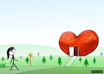
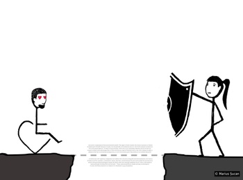
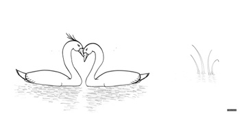
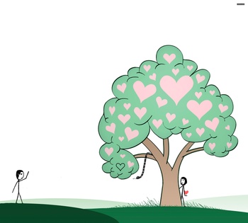
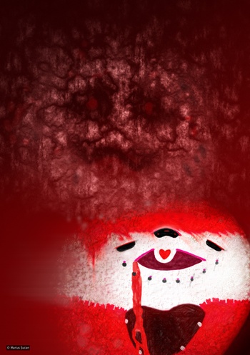
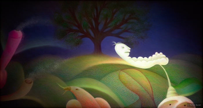
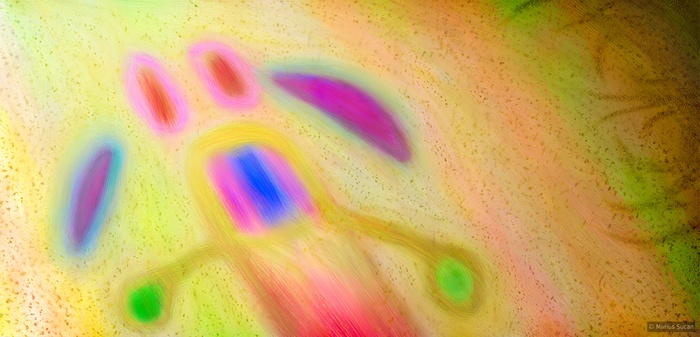
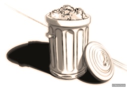
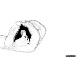
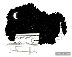
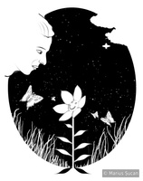
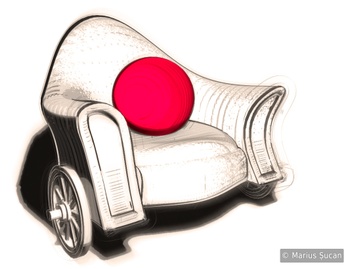
Other than that, I made two new images. Actually the first is quite old, since summer 2009, but only now I completed it. It's called Love routine. I hope you like it.

Love routine

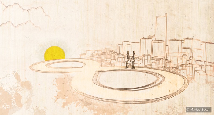
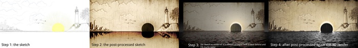
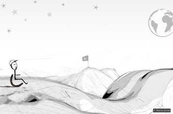
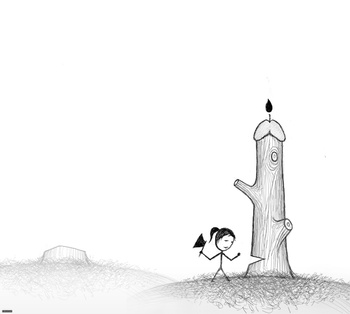
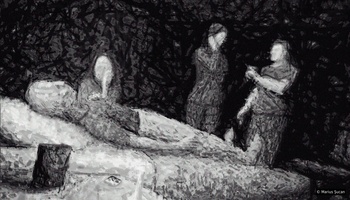
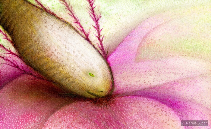
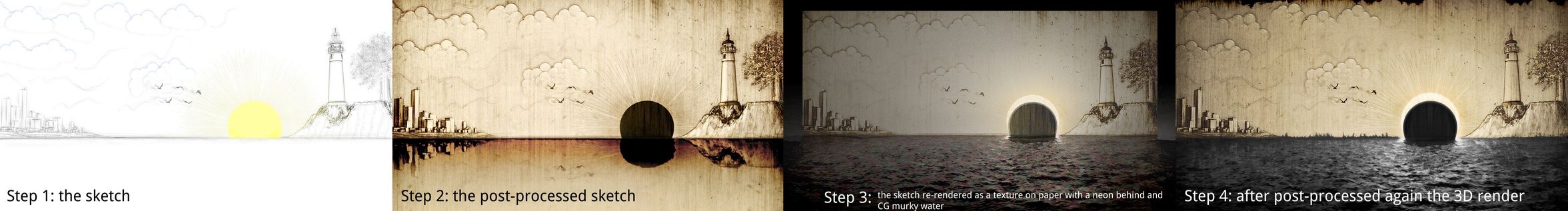
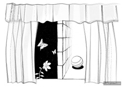
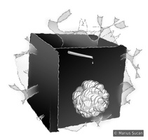
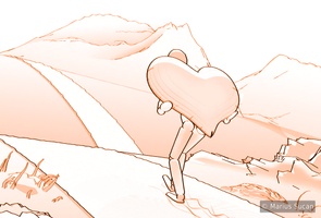
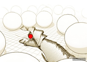
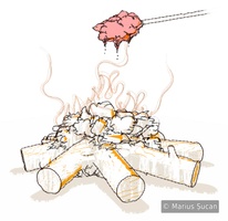
The second image is a bit more weird. The creative process was more elaborate. I used Sketch and Toon for the initial image, then I post-processed it in Photoshop using various shadings rendered within Cinema 4D and even Vray. Then, I used the image as a texture map on a plane in a 3D virtual scene, in which I made the dark, muddy water as a photo-realistic rendition and I also placed a neon light behind the plane which had paper-like shading properties, so light could scatter through it. Afterwards, I got the photo-realistic rendition of the paper and water back in Photoshop for more post-processing. Here's an illustration of what I am talking about:

Failed sunset: making of

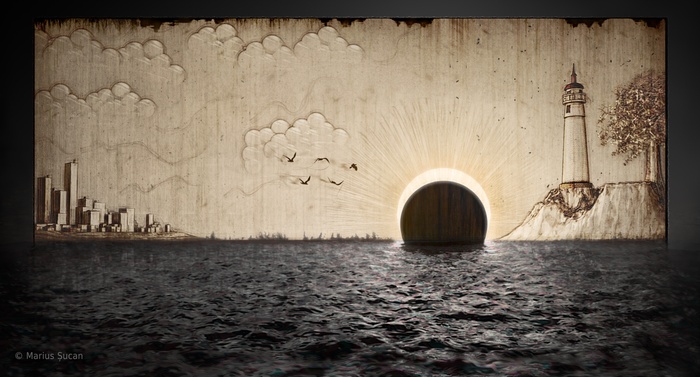
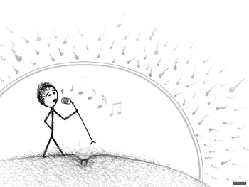
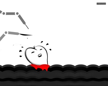
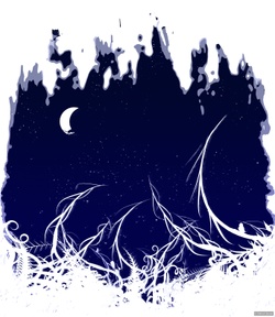
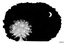
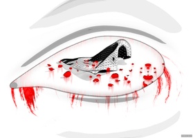
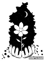
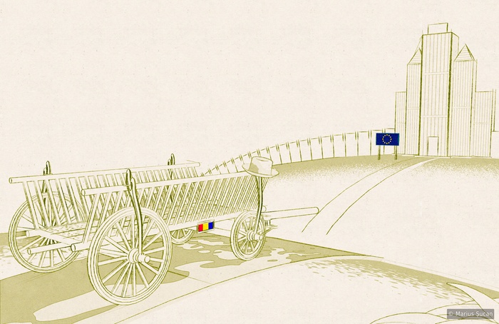
Now, the final image is here: Failed sunset. The meaning of the image is for you to figure out.

Failed sunset

I hope you enjoy these works. 'Till next time, all the best!

More illustrations

Salut!

I continued working on illustrating more artistic texts I had. I decided to publish this new set, so here they are:

Réthorique Lucid dreaming The throne Selfish Discrimination Loneliness Starry night

I hope you enjoy these new illustrations :).

Zgândurele cover Another idea which came into my mind was to create an e-book [a PDF file] with all my writings and the illustrations along side. So, now, those who understand Romanian, can download this PDF instead of surfing the blog to read my texts. I think this is "more manageable"/usable :). I've even designed a front and back cover. The title for this e-book is "Zgândurele".

View the Zgândurele e-book (PDF)

A new category: illustrations

Hello! It's spring time! Creativity in the wild :).

Several days before the Valentine's Day, somebody asked me to do a 3D heart having a red stripe wrapped around it. Given that Valentine's Day was so close, I decided to make my own version of the image. So, my idea was to create a "culinary" one resembling a multitude of fresh tomatoes and also make it look fake, obnoxiously red.

Corporate love

Bandaged heart

Weeks ago, I had an idea of doing sketch like illustrations for my artistic writings. I've done already six sketches for my texts. I am doing all these in 3D with Cinema 4D and Photoshop for corrections or heavy editing. I created a new category in the "My projects" section of my site for them. And, I also moved the image "Integration of Poverty (Romania in E.U.)" to this new category as it fits, being done in the same style. Having worked with the 3D heart for Valentine's, I had a new idea for a funny (or sad) illustration: Love is a burden, which shows an individual carrying a heart up the hill, all alone :).

The cube The vision Dedicated to you Love is a burden The crack The metasight The cold ashes

I hope you enjoy them. Thanks for reading and viewing the images. More will come! :)

Ultimul zid

The saga continues, another Romanian artistic writing.

The throneStând pe tronul întunericului ca o ciripă pe casă, în vântul aspru de iarnă cristalină, mă uit în jur, în luminişul fragil de dincolo de fereastra aprinsă, şi vãd în profunzimea lui o lume care încântă printr-un farmec aparent. Înceţişor, cuvintele din lumea lor încep să se audă ca o şoaptă, gâdilându-mi timpanul ascuţit de peste ani şi ani. Totul este în van când fiecare slovă din spusele lor şoptite, este o pură efemeră. Un zid inconfundabil filtrează ploaia de vorbe cu scopul de a lăsa perplexă fiecare unitate umană. Astfel, zilele continuă într-o aşa zisă linişte, aflându-mă în cutia pandorei ce are menirea de a balansa într-un mod coerent evenimentele şi repetiţia cotidiană.

Mulţumesc că ai citit.

The new site: ROBO Design v5

This is the new ROBO Design web site. Thank you for visiting my blog.

With this new site we made sure that we can keep in-touch with the public more easier. Expect from now on more often updates. Feel free to navigate the simple interface :).

New content on the site:

One new sketch-like image: Integration of poverty

Integration of Poverty

5 new logos: Xeloda, OSCIR, R.R., LibTom Crypt v2, DSCMJ

Xeloda OSCIR RR logo DSCMJ logo LibTom Crypt v2 logo

4 new web sites: Sava Brancovici School, Henri Coandă High School, Școala Generală nr. 5, CIA 2007

Site interface for Henri Coandă High School from Arad, Romania

Sava Brancovici School - site interface Școala Generală nr. 5 - site interface CIA 2007 - site interface

2 new icon packs: Cadastrul Apelor [19 icons], Salarizare Personal [74 icons]

Cadastrul apelor Salarizare personal

One new fancy book cover: LibTom Crypt Developer Manual

LibTom Crypt Developer Manual

... and many new pages.

... 2006 was highly active.

About the site

ROBO Design v5 - front page I've been told that the interface design is not good. The ROBO Design logo is too retro, the colour theme is too brown and... last, but not least the navigation system is not good. Well the reasoning behind this interface was to make a simple, clean one. Nothing too fancy. The colour theme is inspired by the Ubuntu Linux distro, besides this we didn't want to stick to the blue colour. As for the navigation system, it's clear that by having so many menus, we would have cluttered the whole site. We wanted both to have our own pages, our own sort of site. Thus, the decision was to hide the menus under these two named parts/sides.

Newer entries

Older entries

Please subscribe Subscribe to the RSS feed

Current page: 1 of 1.