Free 3D objects

Hello!

It's really been a long time since I posted anything here, in English.

I decided to release all the 3D objects I modeled as .OBJs, with no textures. Very few objects included are in the .C4D file format as well. You may notice when you open the .OBJs that most objects are merged into a single mesh. However, I made sure the merged meshes have easy to separate polygon groups. When I thought it is appropriate, I separated the objects in different meshes.

The quality of the objects I provide is without doubt questionable. It also varies because some of them were made in my youth, others with no care for the results. I made very little improvements to the poor meshes, because I want to provide them as they were used in my works.

Download 3D objects pack (ZIP file, 171 mb)

The .ZIP archive contains the following:

  • furniture objects: tables, chairs and armchairs;
  • a spider and butterflies;
  • vases and plants: waterlilies, mimozas and gerberas;
  • various computer components: monitor, tower, speaker, microphone, webcam and others;
  • 4 reposable robot models: Medieval, Marvin, Morfocae and Umanoid;
  • a piano;
  • a complete church in late baroque style;
  • power panel, trash bin, an incomplete wagon;
  • different types of shoes;
  • cowboy hat, pocket watch;
  • book, pen, crayon;
  • toys: dolls in different poses [C4D file includes a rig], a soldier [reposable] and a car;
  • tools: screwdriver, hammer, plier;

You can also find underneath some images, in the description section, a link to the 3D objects from the scene. This way you can download individually the objects you are interested in.

You can use any object freely for personal uses only, but I would appreciate offering me credit by mentioning my name and my web site address. Thank you.

Windows 7 Accessible Aero theme

Hello, friends!

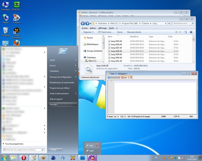
I am a happy Windows 7 x64 user since 1st of January 2010. Although, since day one I wasn't happy about the default Aero theme, because it is too transparent and the title bars texts are not visible on dark wallpapers and such. So, last week I thought of doing something different. Here's a Windows Accessible Aero theme done by me, based on the default Aero theme. I just changed what I thought it lacks contrast. I've searched on-line for such themes, but I liked none of them. As such, I publish this theme for others who might need such a theme.

Download the Windows Accessible Aero theme (ZIP archive)

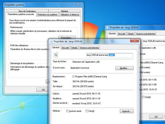
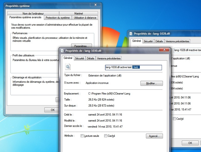
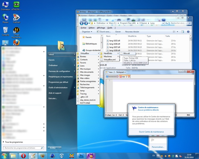
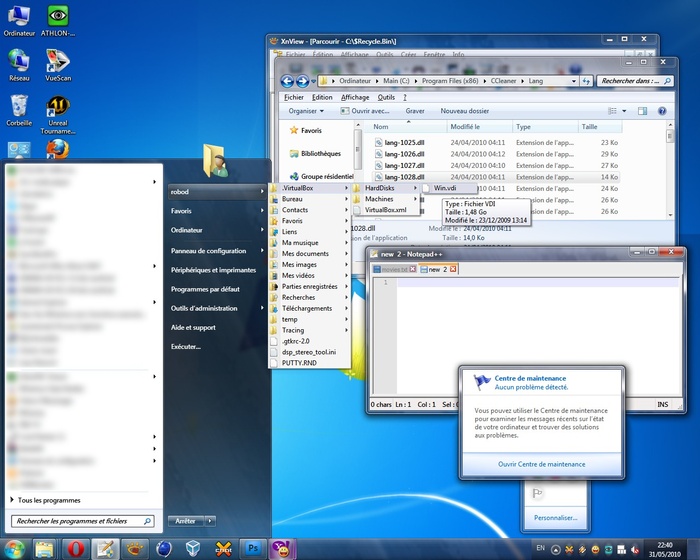
For easiness, I prepared several screen-shots portraying the difference between my theme (Accessible Aero) and the default Aero theme. These screen-shots are a mash-up of different Windows elements, in Basic and Aero modes.

Screen 1: Windows Aero default theme

Screen 1: Accessible Aero theme

Screen 2: Windows Aero default

Screen 2: Accessible Aero theme

Screen 3: Windows Basic default theme

Screen 3: Accessible Aero theme [Basic mode]

If you like what you see, download the Accessible Aero theme here.

Here is a round-up of what this theme features:

  • considerably less transparent glass, dark glass
  • white text title bars with black glows, so they are readable irrespective of the background of the window
  • increased contrast in the title bars for the Basic mode, when not using Aero and I also adjusted the caption buttons accordingly by enhancing the contrast between the glyphs and the buttons
  • a much darker task-bar in Basic mode, making the clock and pop-up titles of the applications running much more readable
  • a darker Start menu in Basic mode
  • increased contrast for the Alt-Tab application switcher in Basic mode
  • added a strong white glow to Alt-Tab app switcher to make the the title visible
  • made text fields slightly more visible
  • defined a clear difference between active and inactive text fields, making the borders thicker
  • a more visible highlighting color for menus, pop-ups menus, while trying to maintain the default look
  • file column headers in Explorer or other applications, are enhanced as well; more visible and a more clear border between them
  • changed the gray text color of tool tips to black for increased readability
  • added dark glow to application titles in task bar and in the thumbnails to avoid situations when the titles are unreadable
  • made the address bar, search field and the whole breadcrumb much more readable; brighter background and darker texts
  • more visible separator in unlocked task-bar and other types of separators or window resize grippers
  • bigger close button in task-bar pop-up thumbnails
  • made the task-bar icons less wide, more ergonomic, both in Basic and Aero modes
  • made more visible the MDI window buttons: close, minimize and restore/maximize
  • restyled the whole task-bar to my personal taste

By now, it is clear what is my main purpose with this theme: readability, accessibility, hence the title. So, it is not about eye-candy, fancy designs, or not even originality. I also published this theme on deviantart.com, for those using dA.

Download the Windows Accessible Aero theme (ZIP archive)

Feel free to send me comments to improve this theme.

Cinema 4D colour theme

Hello!

Incredibly this post is in English ;).

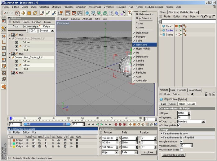
I've decided to publish the colour theme I made for Cinema 4D R10. I didn't like the default one because the colours were too dark for my taste and the overall scheme lacked good contrast between the elements (check boxes, buttons, little switches, etc). For this theme I've changed some buttons to fit with my colours. As you noticed, I am fond of the Windows's colours, so I want my applications to have a consistency in the interface. Most importantly, perhaps, it's that I changed the little tiny dots in the Object Manager. I've made the different states on/off/default very clear and easy to remember.

Hope you like it.

Cinema 4D screenshot

Download the C4D colour theme (RAR archive)

If you like the screen shot, you may download the file. Just extract the files in your \%Cinema 4D installation folder%\resource\schemes\ and run C4D R10 :). Select the colour theme from the Preferences dialog.

P.S. Don't worry about the French user interface.

Newer entries

Older entries

Please subscribe Subscribe to the RSS feed

Current page: 1 of 1.