This is the new ROBO Design web site. Thank you for visiting my blog.
With this new site we made sure that we can keep in-touch with the public more easier. Expect from now on more often updates. Feel free to navigate the simple interface :).
New content on the site:
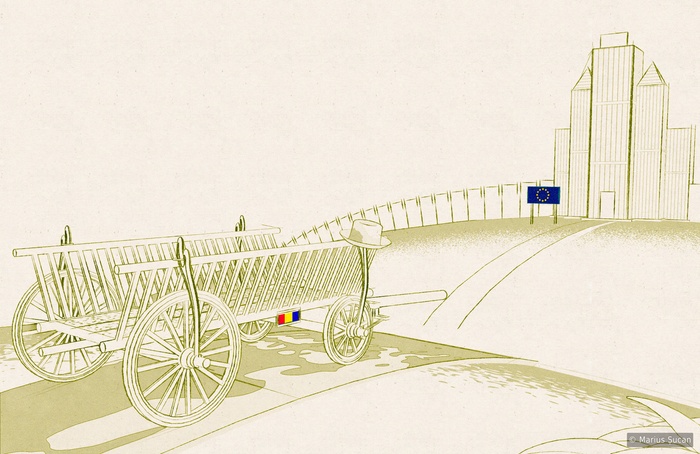
One new sketch-like image: Integration of poverty
5 new logos: Xeloda, OSCIR, R.R., LibTom Crypt v2, DSCMJ
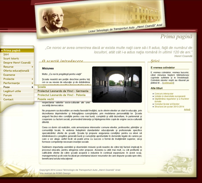
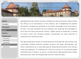
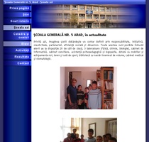
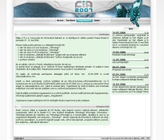
4 new web sites: Sava Brancovici School, Henri Coandă High School, Școala Generală nr. 5, CIA 2007
2 new icon packs: Cadastrul Apelor [19 icons], Salarizare Personal [74 icons]
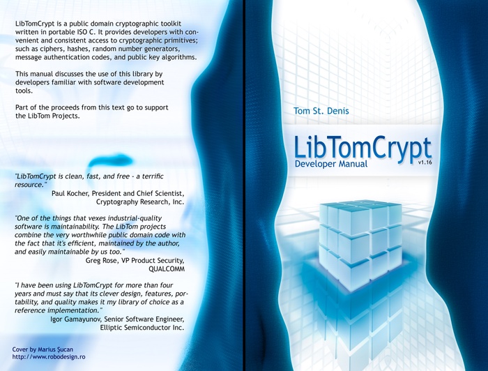
One new fancy book cover: LibTom Crypt Developer Manual
... and many new pages.
... 2006 was highly active.
About the site
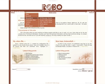 I've been told that the interface design is not good. The ROBO Design logo is too retro, the colour theme is too brown
and... last, but not least the navigation system is not good. Well the reasoning behind this interface was to make a simple,
clean one. Nothing too fancy. The colour theme is inspired by the Ubuntu Linux distro, besides this we didn't want to stick
to the blue colour. As for the navigation system, it's clear that by having so many menus, we would have cluttered the
whole site. We wanted both to have our own pages, our own sort of site. Thus, the decision was to hide the menus under
these two named parts/sides.
