Windows 7 Accessible Aero theme

Hello, friends!

I am a happy Windows 7 x64 user since 1st of January 2010. Although, since day one I wasn't happy about the default Aero theme, because it is too transparent and the title bars texts are not visible on dark wallpapers and such. So, last week I thought of doing something different. Here's a Windows Accessible Aero theme done by me, based on the default Aero theme. I just changed what I thought it lacks contrast. I've searched on-line for such themes, but I liked none of them. As such, I publish this theme for others who might need such a theme.

Download the Windows Accessible Aero theme (ZIP archive)

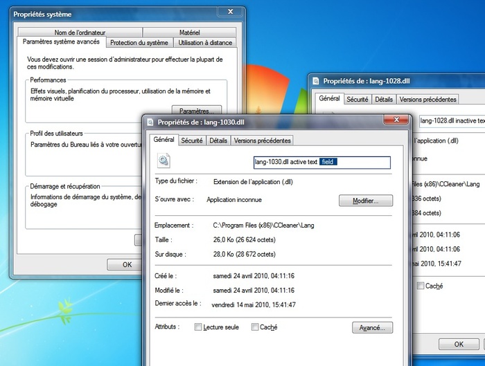
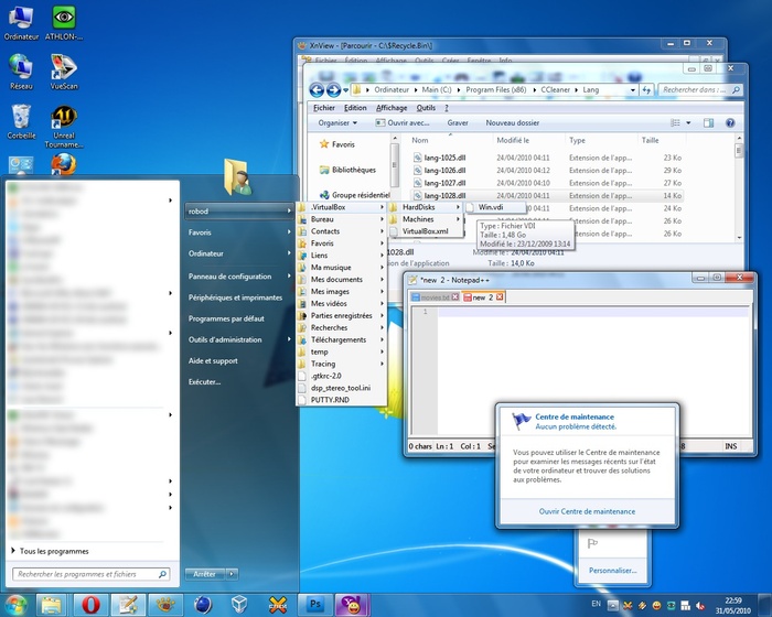
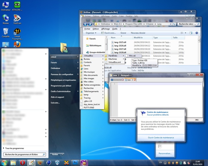
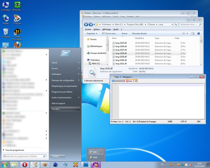
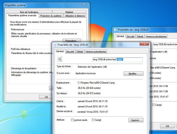
For easiness, I prepared several screen-shots portraying the difference between my theme (Accessible Aero) and the default Aero theme. These screen-shots are a mash-up of different Windows elements, in Basic and Aero modes.

Screen 1: Windows Aero default theme

Screen 1: Accessible Aero theme

Screen 2: Windows Aero default

Screen 2: Accessible Aero theme

Screen 3: Windows Basic default theme

Screen 3: Accessible Aero theme [Basic mode]

If you like what you see, download the Accessible Aero theme here.

Here is a round-up of what this theme features:

  • considerably less transparent glass, dark glass
  • white text title bars with black glows, so they are readable irrespective of the background of the window
  • increased contrast in the title bars for the Basic mode, when not using Aero and I also adjusted the caption buttons accordingly by enhancing the contrast between the glyphs and the buttons
  • a much darker task-bar in Basic mode, making the clock and pop-up titles of the applications running much more readable
  • a darker Start menu in Basic mode
  • increased contrast for the Alt-Tab application switcher in Basic mode
  • added a strong white glow to Alt-Tab app switcher to make the the title visible
  • made text fields slightly more visible
  • defined a clear difference between active and inactive text fields, making the borders thicker
  • a more visible highlighting color for menus, pop-ups menus, while trying to maintain the default look
  • file column headers in Explorer or other applications, are enhanced as well; more visible and a more clear border between them
  • changed the gray text color of tool tips to black for increased readability
  • added dark glow to application titles in task bar and in the thumbnails to avoid situations when the titles are unreadable
  • made the address bar, search field and the whole breadcrumb much more readable; brighter background and darker texts
  • more visible separator in unlocked task-bar and other types of separators or window resize grippers
  • bigger close button in task-bar pop-up thumbnails
  • made the task-bar icons less wide, more ergonomic, both in Basic and Aero modes
  • made more visible the MDI window buttons: close, minimize and restore/maximize
  • restyled the whole task-bar to my personal taste

By now, it is clear what is my main purpose with this theme: readability, accessibility, hence the title. So, it is not about eye-candy, fancy designs, or not even originality. I also published this theme on deviantart.com, for those using dA.

Download the Windows Accessible Aero theme (ZIP archive)

Feel free to send me comments to improve this theme.
Cinema 4D colour theme

Hello!

Incredibly this post is in English ;).

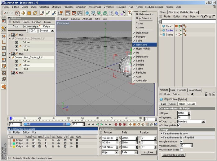
I've decided to publish the colour theme I made for Cinema 4D R10. I didn't like the default one because the colours were too dark for my taste and the overall scheme lacked good contrast between the elements (check boxes, buttons, little switches, etc). For this theme I've changed some buttons to fit with my colours. As you noticed, I am fond of the Windows's colours, so I want my applications to have a consistency in the interface. Most importantly, perhaps, it's that I changed the little tiny dots in the Object Manager. I've made the different states on/off/default very clear and easy to remember.

Hope you like it.

Cinema 4D screenshot

Download the C4D colour theme (RAR archive)

If you like the screen shot, you may download the file. Just extract the files in your \%Cinema 4D installation folder%\resource\schemes\ and run C4D R10 :). Select the colour theme from the Preferences dialog.

P.S. Don't worry about the French user interface.

New Winamp3 skin: RODE 3 Lite

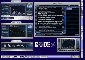
Today we released the fourth Winamp 3 skin. This is the Lite edition of the RODE3 skin for Winamp 3. The Full version will have many more features and maybe few minor changes to the interface - it will be released when we have the time to make it.

Current features:

  • new Visualization panel with 6 cool and unique visualizations
  • new About RODE3 panel
  • new advanced ROBO Browser - now you can browse the web using Winamp 3!
  • skinning of all components, menus and tool tips
  • bass, treble options in equalizer
  • main window horizontal shade mode
  • main window 100% REAL vertical shade mode
  • play list horizontal shade mode
  • integrated playback buttons and song position in all component windows
  • 373 color themes - making sure you will find the combination of colors that best fits your desktop!
  • unique, easy to use and useful interface - perfectly fitting the daily needs of any music fan

RODE 3 Lite screen shot

Begin now the download of RODE3 Lite!

New Winamp3 skin: uDesignIT

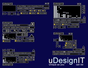
uDesignIT screen shot My third Winamp3 skin is finally here! It is featuring a very unique approach to skinning - you will be amazed!

This skin might not look interesting at first glance, but I am sure you will be amazed by the usability and utility of this very unique skin. You will be able to create your own personal and unique design in the first 5 minutes after installing this skin on your system!

  • create unique window-shade modes and put them always-on-top wherever you want
  • create unique and personal designs best fitting your needs
  • you will no longer have to accept the limited window-shade modes in other skins
  • easy, fast and usable!

Click here to begin the download of uDesignIT !

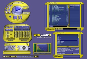
WINyaMP3 v2 released

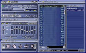
WINyaMP3 had a total of about 60,000 downloads on different sites. I received many requests, for winshade mode or color themes.. I now finished WINyaMP3 v2, which is based on user requests.

Download WINyAMP3 v2 now!.

New in this version:

  • 35 color themes (requested by users)
  • resizable equalizer, thinger and main windows - by adding a Control Menu (on main window click on the playing status image). This was also requested by users!
  • added winshade mode for main window (requested by users)
  • skinning all components (including menus)
  • new Configuration panel with: enable/disable song ticker scrolling, show/hide MiniPlayer, enable/disable shadows (desktop alpha), always on top, display numbers in play list and... color themes switcher included!
  • new About and Visualization panels
  • new panel
  • much better scripting
  • now you can make your Winamp 3 work faster using the Configuration panel!

WINyAMP v2 screen shot

Newer entries

Older entries

Please subscribe Subscribe to the RSS feed

Current page: 1 of 1.