Updates before autumn

Salut!

It's autumn already, and I've been doing quite a few things during the summer. I learned CSS and HTML, yay! It was a piece of cake. I learned, because I already started work on my new site. I hope it will be finished by the end of the year. Coding of CSS/HTML and the design is finished already, but I am waiting for my twin brother to code the required functionality in JS and PHP, but he is really busy with an internship at Mozilla.

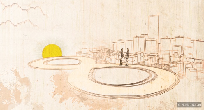
Other than that, I made two new images. Actually the first is quite old, since summer 2009, but only now I completed it. It's called Love routine. I hope you like it.

Love routine

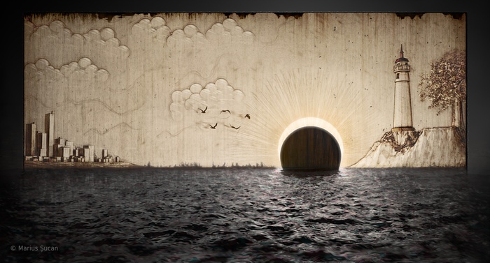
The second image is a bit more weird. The creative process was more elaborate. I used Sketch and Toon for the initial image, then I post-processed it in Photoshop using various shadings rendered within Cinema 4D and even Vray. Then, I used the image as a texture map on a plane in a 3D virtual scene, in which I made the dark, muddy water as a photo-realistic rendition and I also placed a neon light behind the plane which had paper-like shading properties, so light could scatter through it. Afterwards, I got the photo-realistic rendition of the paper and water back in Photoshop for more post-processing. Here's an illustration of what I am talking about:

Failed sunset: making of

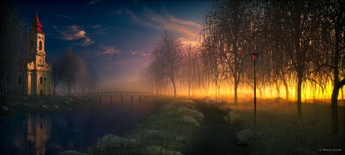
Now, the final image is here: Failed sunset. The meaning of the image is for you to figure out.

Failed sunset

I hope you enjoy these works. 'Till next time, all the best!
Windows 7 Accessible Aero theme

Hello, friends!

I am a happy Windows 7 x64 user since 1st of January 2010. Although, since day one I wasn't happy about the default Aero theme, because it is too transparent and the title bars texts are not visible on dark wallpapers and such. So, last week I thought of doing something different. Here's a Windows Accessible Aero theme done by me, based on the default Aero theme. I just changed what I thought it lacks contrast. I've searched on-line for such themes, but I liked none of them. As such, I publish this theme for others who might need such a theme.

Download the Windows Accessible Aero theme (ZIP archive)

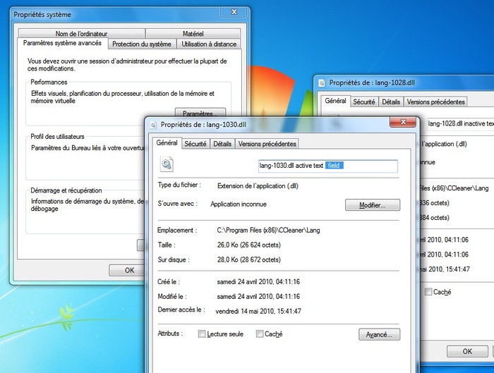
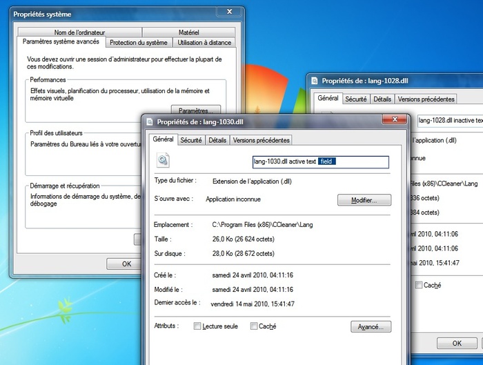
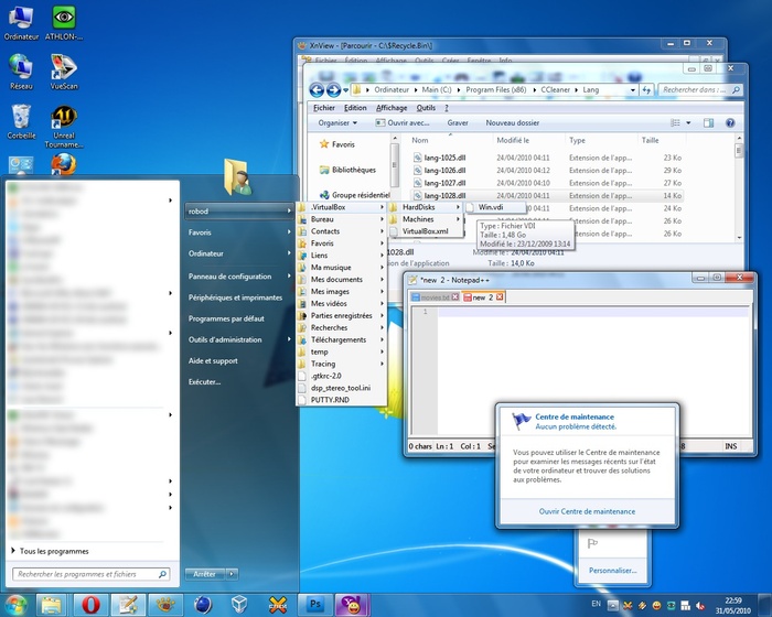
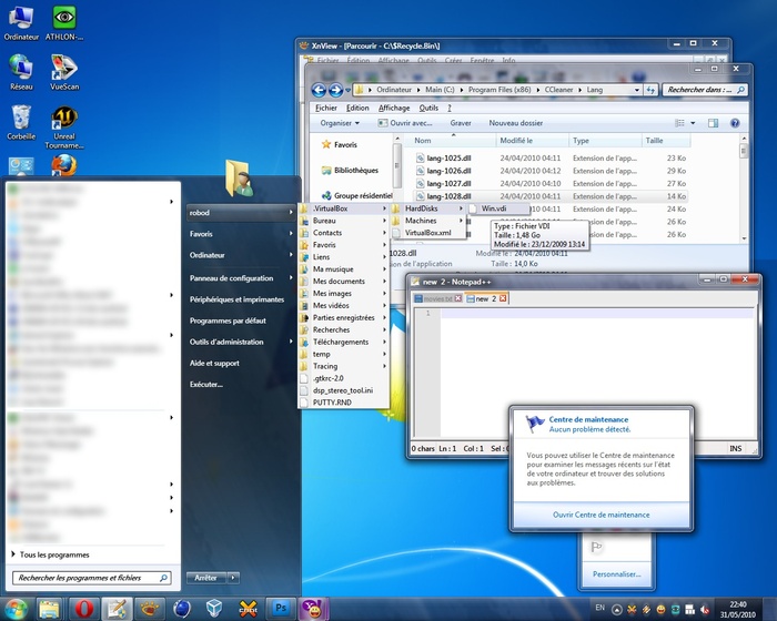
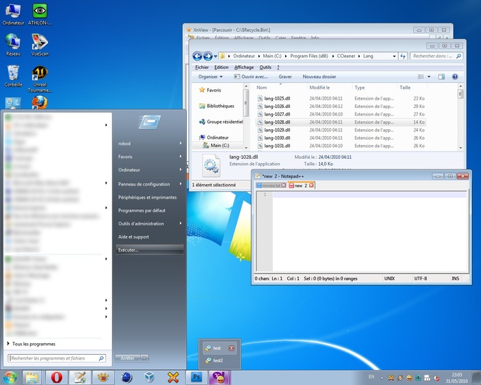
For easiness, I prepared several screen-shots portraying the difference between my theme (Accessible Aero) and the default Aero theme. These screen-shots are a mash-up of different Windows elements, in Basic and Aero modes.

Screen 1: Windows Aero default theme

Screen 1: Accessible Aero theme

Screen 2: Windows Aero default

Screen 2: Accessible Aero theme

Screen 3: Windows Basic default theme

Screen 3: Accessible Aero theme [Basic mode]

If you like what you see, download the Accessible Aero theme here.

Here is a round-up of what this theme features:

  • considerably less transparent glass, dark glass
  • white text title bars with black glows, so they are readable irrespective of the background of the window
  • increased contrast in the title bars for the Basic mode, when not using Aero and I also adjusted the caption buttons accordingly by enhancing the contrast between the glyphs and the buttons
  • a much darker task-bar in Basic mode, making the clock and pop-up titles of the applications running much more readable
  • a darker Start menu in Basic mode
  • increased contrast for the Alt-Tab application switcher in Basic mode
  • added a strong white glow to Alt-Tab app switcher to make the the title visible
  • made text fields slightly more visible
  • defined a clear difference between active and inactive text fields, making the borders thicker
  • a more visible highlighting color for menus, pop-ups menus, while trying to maintain the default look
  • file column headers in Explorer or other applications, are enhanced as well; more visible and a more clear border between them
  • changed the gray text color of tool tips to black for increased readability
  • added dark glow to application titles in task bar and in the thumbnails to avoid situations when the titles are unreadable
  • made the address bar, search field and the whole breadcrumb much more readable; brighter background and darker texts
  • more visible separator in unlocked task-bar and other types of separators or window resize grippers
  • bigger close button in task-bar pop-up thumbnails
  • made the task-bar icons less wide, more ergonomic, both in Basic and Aero modes
  • made more visible the MDI window buttons: close, minimize and restore/maximize
  • restyled the whole task-bar to my personal taste

By now, it is clear what is my main purpose with this theme: readability, accessibility, hence the title. So, it is not about eye-candy, fancy designs, or not even originality. I also published this theme on deviantart.com, for those using dA.

Download the Windows Accessible Aero theme (ZIP archive)

Feel free to send me comments to improve this theme.

Experimenting with painting

Hello!

I finished two new images. In December 2009, I bought a Wacom Bamboo tablet to start painting. These two images are the first ones I did with the tablet. Both are just some exercises I did in order to learn to paint.

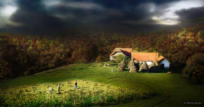
The latest painting exercise is "Remote village". This painting is done after a photograph I had from the village where my grandmother currently lives. The photograph was considerably much more different. After I finished manually repainting the whole photograph, I began improvising. I added two trees, a horse and another peasant. I also changed the weather and time of year. It was a clear sunny mid-summer day.

Remote village

The first painting exercise I did was to repaint and to add details to a previous sketchy image I did in 2008. The original image is "Love is a burden" and it is still available on the site.

Love is a burden [2010]

There's more to come. I still plan to do more types of exercises. I hope you guys like them. :)

New project: church in landscape

Hallöchen!

It's been a long time since I posted anything new. But, here I am with a new set of images.

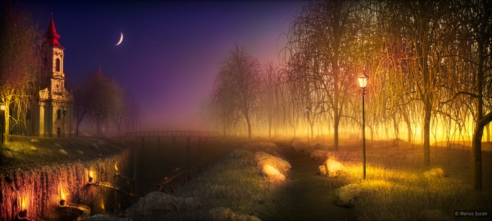
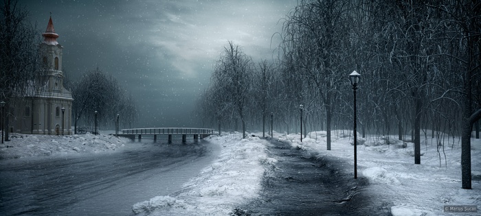
Since November 2009, I've been working on something new. The initial idea was to do a landscape image using a new technique developed by me to achieve a final image. The 3D scene is rendered in customized layers, without using the usual built-in functionality of rendering multi-pass images. As such, I do not have a layer for each shading aspect, like specularities, reflections, shadows, GI, etc. My layers are obtained by having multiple instances of the 3D scene with different light setups or different textures, thus, in the end, I only separate the lights by type and the color/texture maps. And, of course, for easing the post-processing, I use depth maps and masks for specific objects or class of objects. All the layers are then composited in Photoshop. The actual rendering, if I may say so, is done in composition, where I can control each aspect, much more accurately than in 3D, and it also contributes to getting closer to painting. Due to the endless possibilities, I made three versions of the image.

I used Cinema 4D, Vray to render the images and Photoshop to composite the different layers I rendered. I used Vray Proxies for the first time. I was amazed by the amount of polygons I am able to render. The scene has approximately 30-40 millions of polygons.

The church is a 3D reproduction done by me after a real church which was built in 1821 by the Austrian-Hungarian empire. The architectural style is late baroque, with simple ornaments. The real church is located across the street, where I live.

Colourful in silence

Wide illusion

Frozen serenity

I hope you guys will enjoy the images as much as I enjoyed doing them ;).