Hello!
I finished two new images. In December 2009, I bought a Wacom Bamboo tablet to start painting. These two images are the first ones I did with the tablet. Both are just some exercises I did in order to learn to paint.
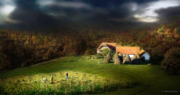
The latest painting exercise is "Remote village". This painting is done after a photograph I had from the village where my grandmother currently lives. The photograph was considerably much more different. After I finished manually repainting the whole photograph, I began improvising. I added two trees, a horse and another peasant. I also changed the weather and time of year. It was a clear sunny mid-summer day.
The first painting exercise I did was to repaint and to add details to a previous sketchy image I did in 2008. The original image is "Love is a burden" and it is still available on the site.
![Love is a burden [2010]](/_astro/love-is-a-burden-2010-srgb.3dd0f18a_Wzmhs.jpg)
There's more to come. I still plan to do more types of exercises. I hope you guys like them. :)
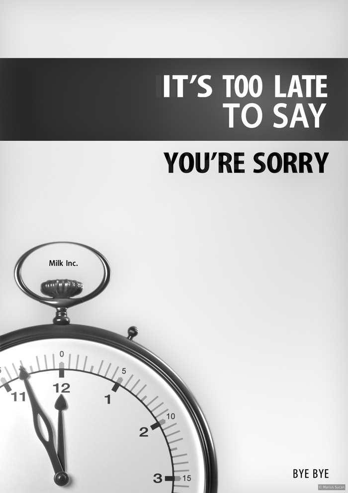
![It is too late [center]](/_astro/it-is-too-late-center.0291385b_1F3KLh.jpg)


![Valentine's day warning [French]](/_astro/valentine-day-warning.b9d7e6aa_v7YX1.jpg)
![I don't love you [EN]](/_astro/i-dont-love-you-eng-big.47d5c8be_ZnaEmE.jpg)
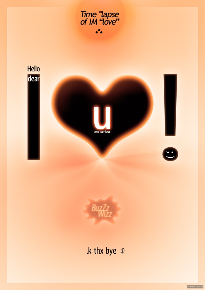
![Time lapse of IM love [B/W]](/_astro/time-lapse-of-im-love-bw-big.94471f65_Z2cs4nx.jpg)
